
On the Monthly chart, the most important bars are those of AUG2015, and JAN2016. Both are huge bearish bars each one with a range of almost a typical Yearly bar.
AUG2015 was an attempt to take out the low of year 2014, and took out the major LLBH (Last Low Before High) made on OCT2014.
JAN2016 started the current attempt to make a follow thru, by taking out the low of AUG2015.
If the price does succeed to take out the low of AUG2015 which is the yearly low, that is a very meaningful sign, as will be shown later, by the Yearly chart.
Back to the monthly, the monthly 50SMA (Green line) can serve as a considerable support, as it did for January. A very typical scenario in such cases is for February to continue the decline, but much slower, decreasing volatility, where most of the price action, if not all of it – stay inside the long tail of January, and maybe making a small monthly Low. In case the yearly low is still being respected by the end of February, March can be a small bullish bar, a contra for February, and might come back to January’s Close level.
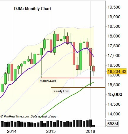
DJIA: Monthly chart (at the courtesy of prorealtime.com)
The weekly bars are sitting on a band of moving averages, where most of the long term moving averages currently are (the yellow band). It is another reason for the price to stay in the current weekly range, with a tendency to continue declining in the coming weeks, lowering the overall volatility.
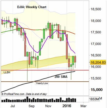
DJIA: Weekly Chart (at the courtesy of prorealtime.com)
Let’s have a look on a yearly perspective, how important was taking out (for the first time that a move started) the Yearly Low (Or high) during the past 30 years. Starting from point A, year 1982 that after making a LL took out the year 1981’s high and started 19 years of bullish market, each year is a HL year, and even the crash of 1987 would look as a normal spike up. Taking out the low of year 2000 (point B) toggled into the dot com bearish market, whereas the first HH toggled the bullish market after that (point C). Again in year 2008, taking out the yearly low toggled into the subprime bearish market (D), and by taking out the high of year 2009 (E), the current bullish market took off.
Sure no one can guarantee that this is going to be the case on the next yearly LL, but it helps you to understand the correct long term sentiment when analyzing and taking actions on smaller timeframes.
We can see that although this signal is given sometimes very late, there was still more than 50% of the next move – being left on the table. We can see also, that you don’t really know when the real move start, as there were cases in which it took another year and more, while the price is back in the losing territory.
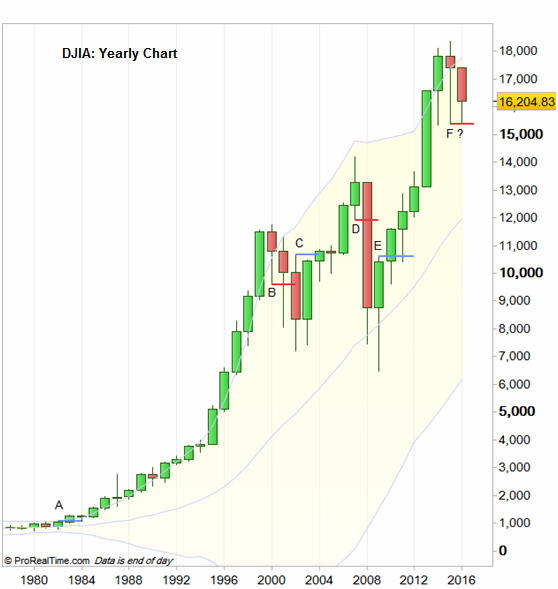
DJIA: Yearly chart (at the courtesy of prorealtime.com)
Disclaimer : Anyone who takes action by this article does It at his own risk, and the writer won’t have any liability for any damages caused by this action